I thoroughly examined the history and existing features of iTop to pinpoint areas where enhancements could elevate user experience. This involved not only understanding the product's evolution but also delving into user feedback and market trends. Armed with these insights, I embarked on a redesign journey.
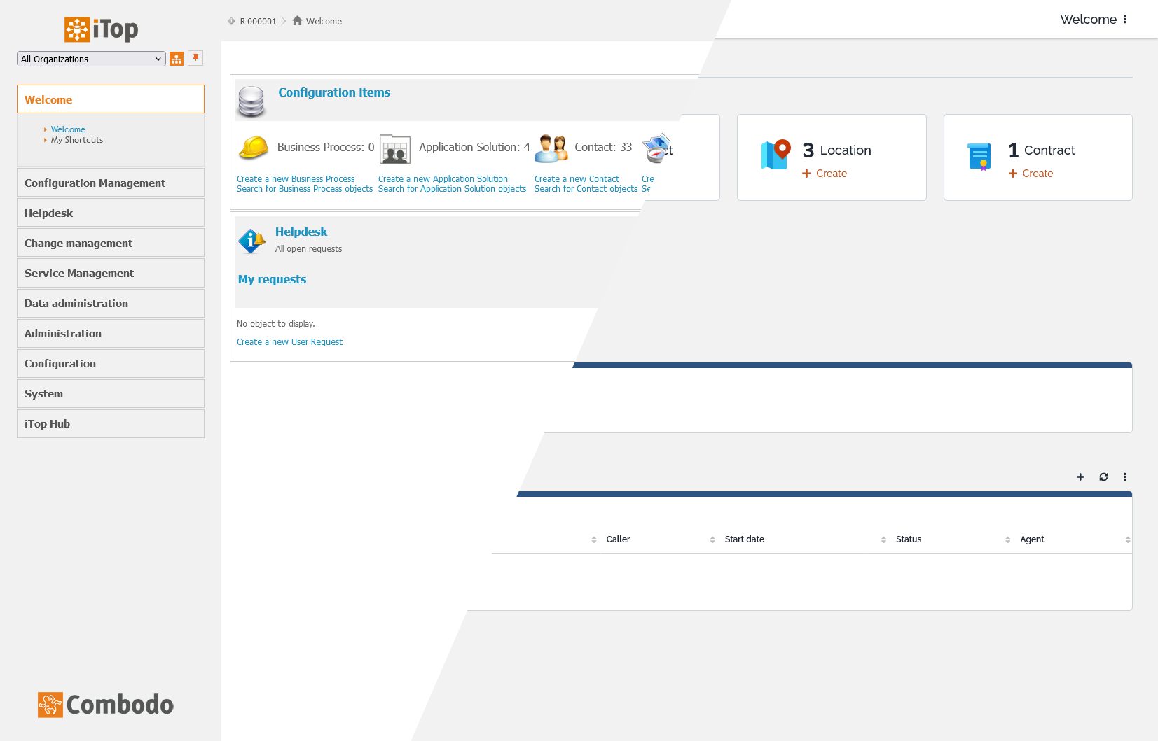
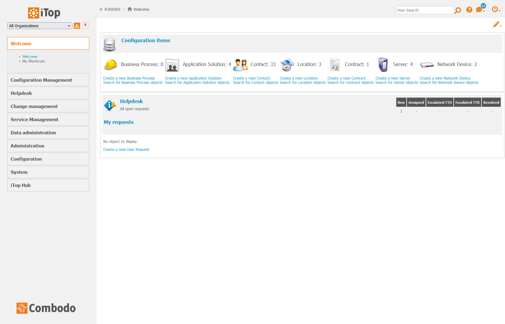
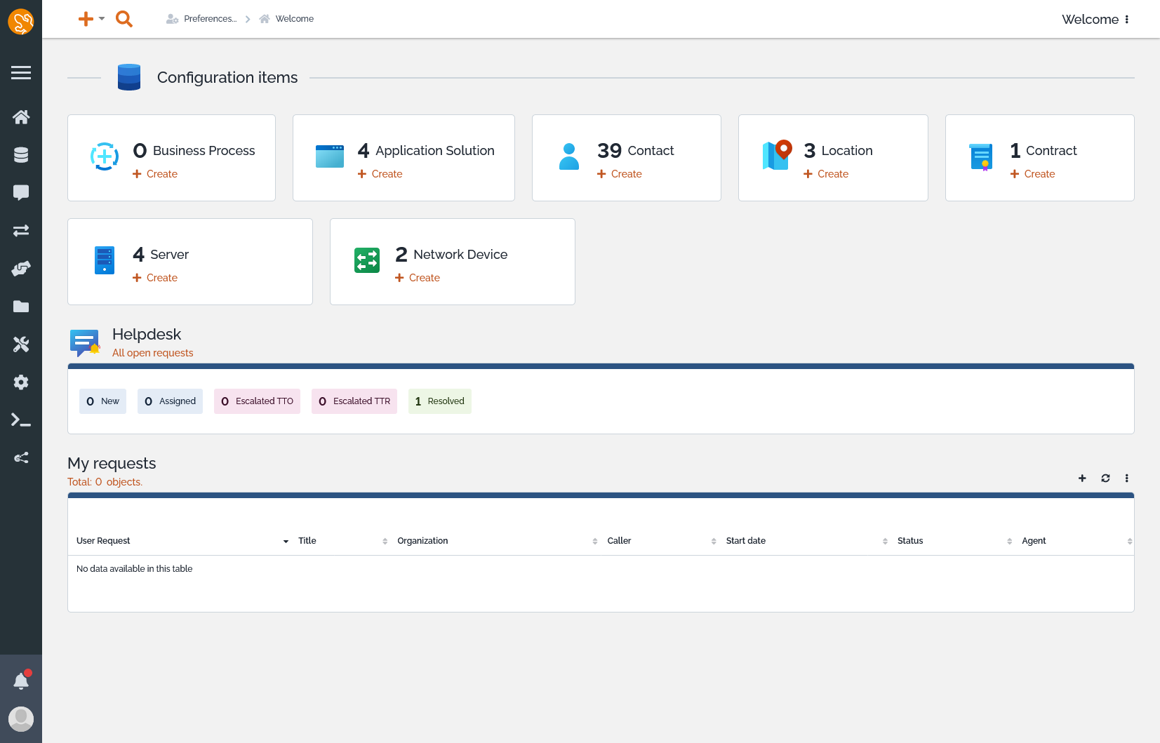
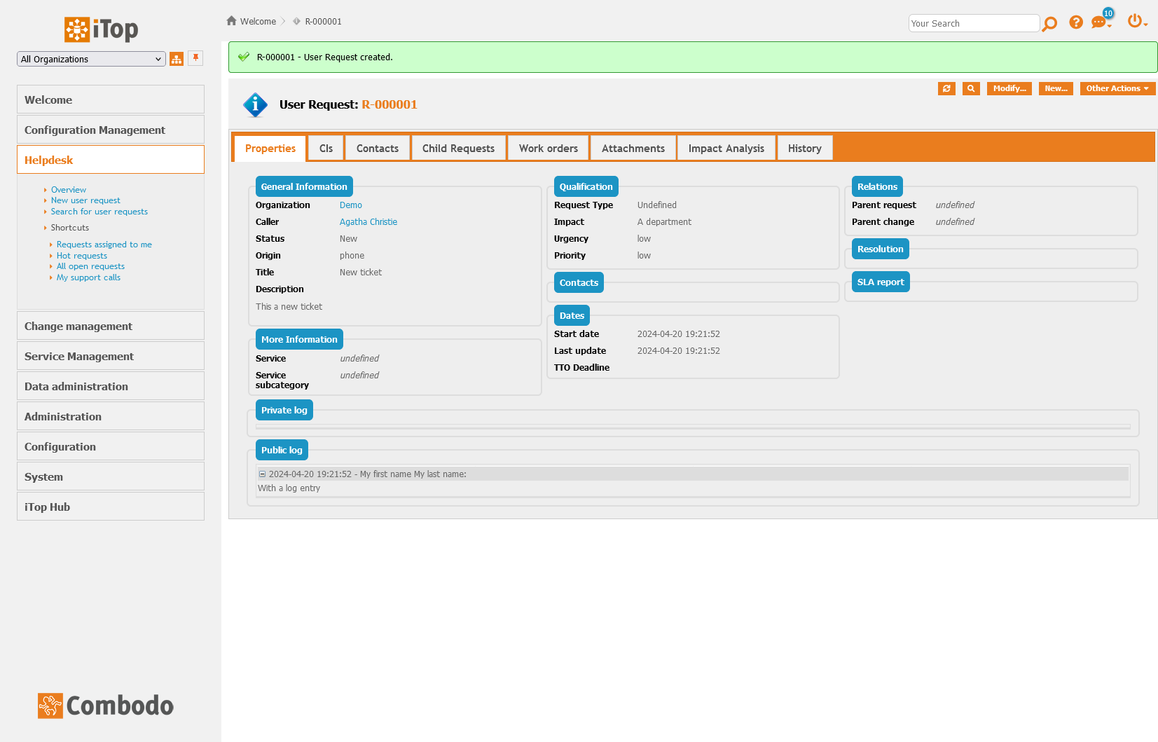
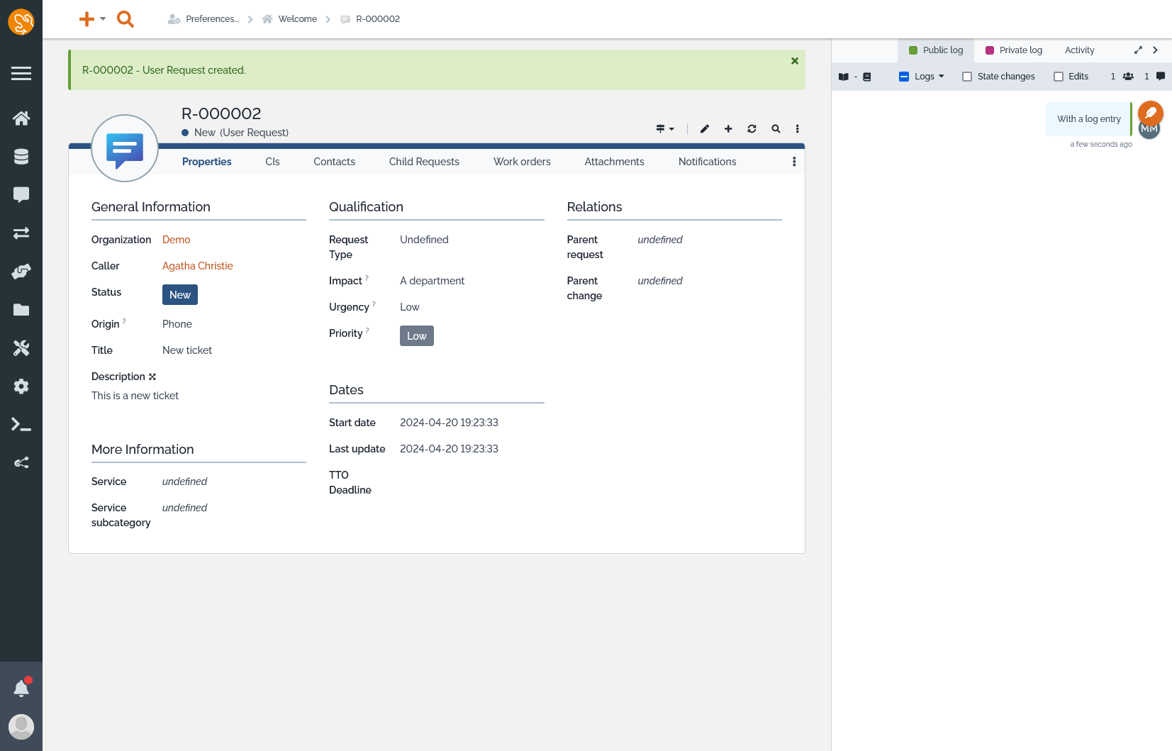
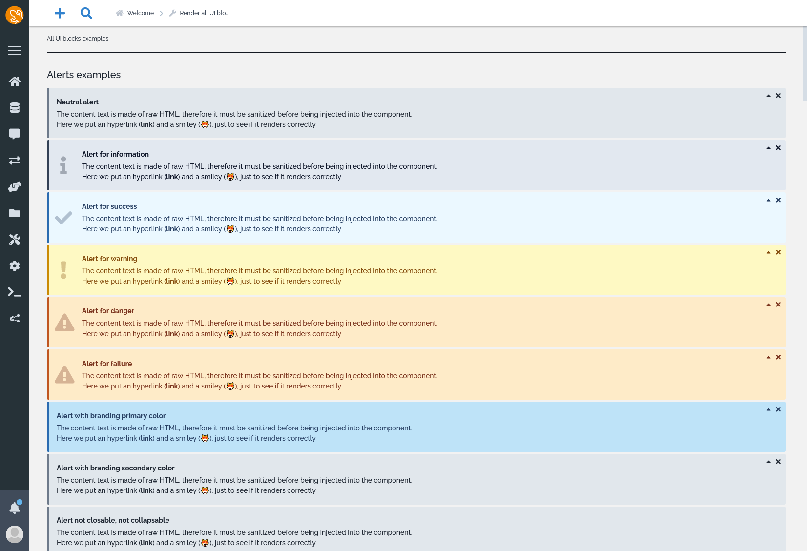
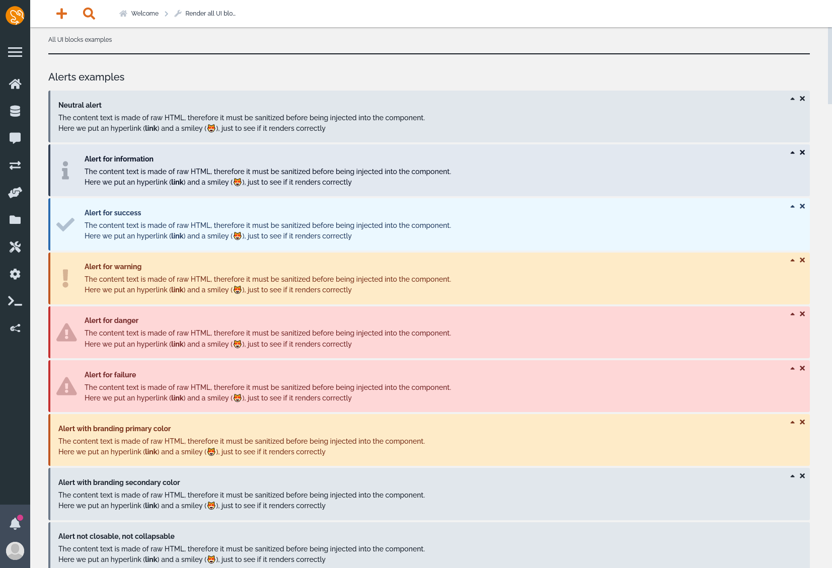
I developed a detailed mockup of a fresh, user-centric design aimed at addressing pain points and enhancing usability. This design wasn't just about aesthetics; it was about creating an intuitive and accessible interface that guides users seamlessly through their tasks while reflecting the brand's identity. Presenting this mockup to users allowed for invaluable feedback, which was carefully integrated into the iterative design process. The result was not just a new look but a revamped experience that resonated with users and aligned with the company's goals.
It also meant building a front-end framework from scratch allowing developers to easily manipulate UI elements while also keeping the design harmonized. This new design is fully customizable and themeable for all users that cares about product personnalization.
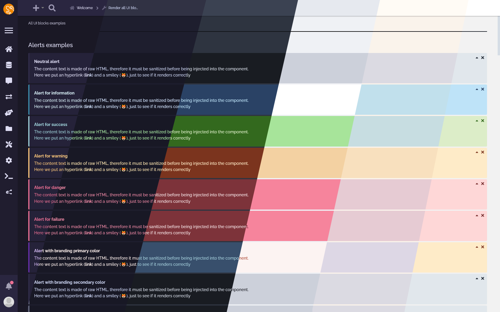
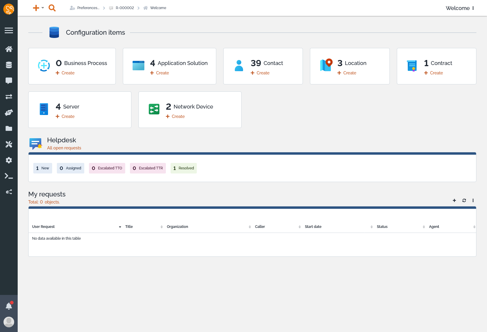
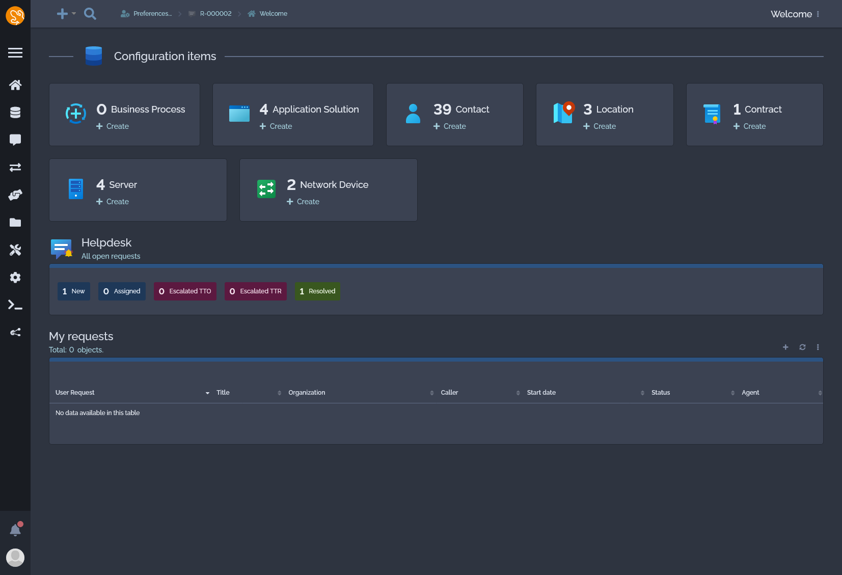
I led the custom frontend framework developement for iTop, which served as the foundation for creating multiple themes tailored to different user needs. I meticulously crafted themes with specific purposes in mind, ranging from reducing eye strain and enhancing contrast to catering to color-blind users and purely aesthetic considerations.
Each theme was designed to optimize user experience and accessibility, demonstrating a commitment to inclusive design principles. Some theme were built on my work time from my own initiative to push accessibility, others were built on my free time and given under open-source license to iTop community.
I also took the lead in transforming the visual identity of our product vignettes in the shop at Combodo, overseeing the process of harmonization and enhancement. This involved a strategic shift away from generic stock photos towards custom-designed vignettes that not only elevated the aesthetic appeal but also effectively communicated the essence of each product.
By spearheading this initiative, I aimed to create a more engaging and informative shopping experience for our customers.

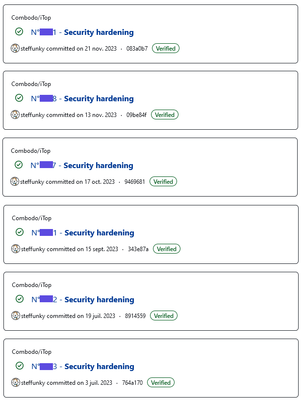
I have a solid understanding of security issues and how to address them. I'm skilled at reading reports about vulnerabilities and quickly fixing them to keep systems safe. I also know how to handle CVEs and write advisories to let others know about the fixes.
I'm proactive about security, always looking for ways to prevent problems before they happen. I've successfully fixed various vulnerabilities, like XSS issues in different parts of our applications. I also make sure we don't accidentally reveal sensitive information such as full path disclosure.
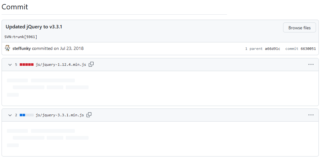
I've successfully upgraded various libraries, including some with significant version differences. After testing to ensure everything still works correctly, I develop a detailed upgrade plan. This involves identifying and addressing any deprecated or deleted features, as well as refactoring legacy code to take advantage of new functionalities. Additionally, I document the upgrade process internally and on public wikis to facilitate future upgrades and ensure seamless transitions.

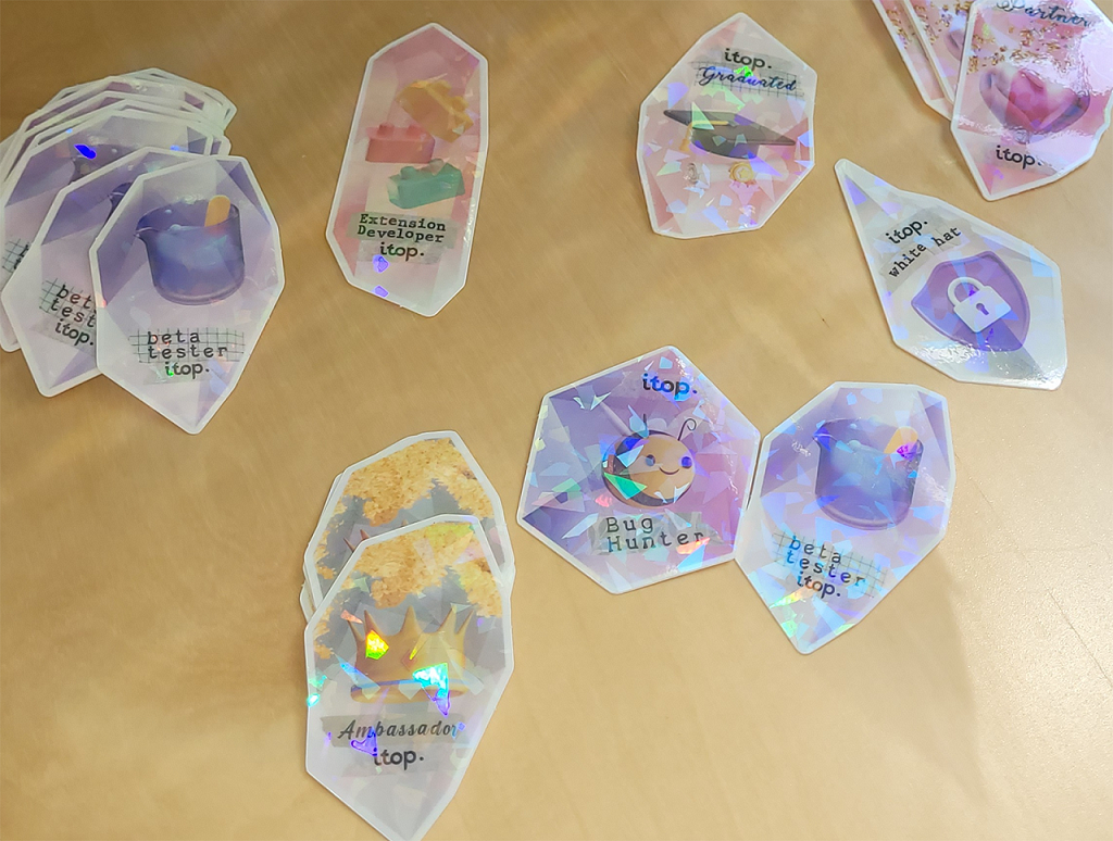
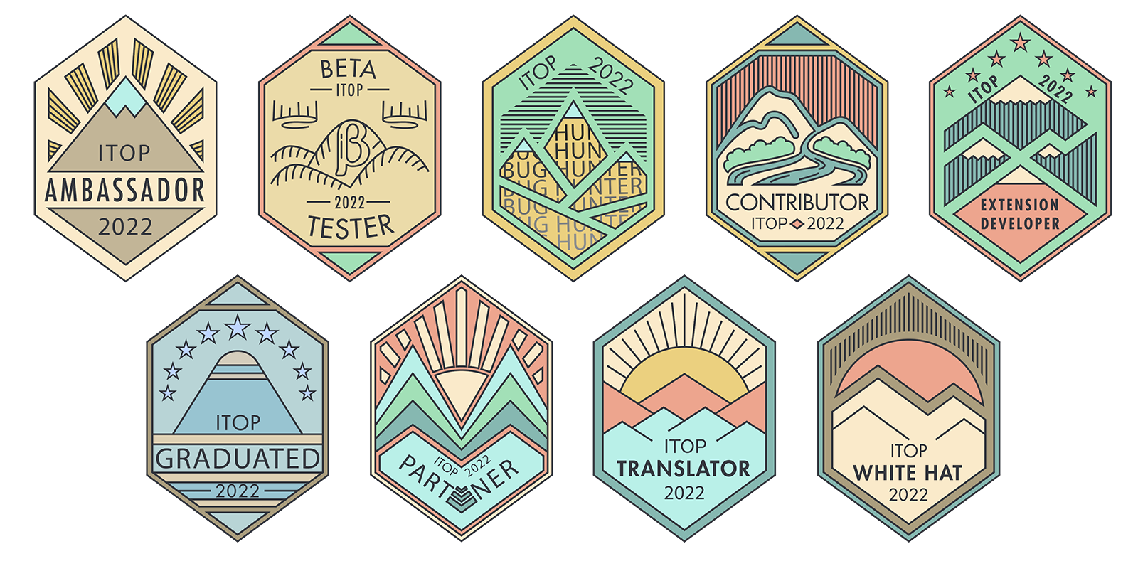
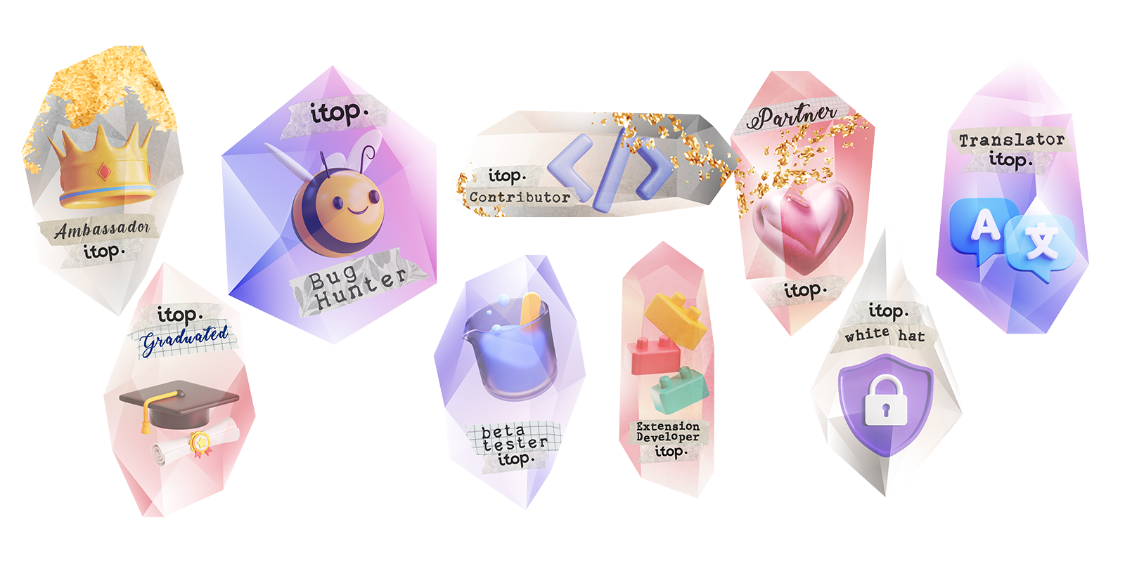
Over the course of four years at Combodo, I spearheaded the design and creation of annual stickers for our vibrant open-source community. Each year, these stickers were meticulously crafted with unique designs aimed at fostering community engagement and appreciation.
These stickers served not only as tokens of appreciation but also as catalysts for community cohesion and pride.